Building a Cohesive Visual Identity from Limited Direction
How I transformed a simple logo into a full aesthetic system and created a unified brand experience through intentional color, imagery, and design choices.
The Goal:
When I began this project, the only design guidance I received was the logo and a request to use its colors for the site. The logo included a bright red and several shades of blue that did not naturally complement each other, so I made thoughtful decisions about how to use them in a way that would still feel modern, balanced, and professional.
To create visual harmony, I chose a darker, more sophisticated blue for background sections. This not only grounded the layout but also complemented the bright red in the logo. I then used the lighter blue from the logo as an accent color for text, lines, and highlights. This approach created a clear visual hierarchy and allowed the palette to feel cohesive rather than chaotic.
Since the client provided no other brand direction, I built the entire visual identity from scratch. I curated imagery that matched the mood of the new palette: rich tones, calm lighting, and a luxurious, wellness inspired aesthetic centered on water, clarity, and quality. These intentional choices created a strong foundation for the brand’s voice and visual style.
Cohesive Image System:
This curated collage represents the visual direction I developed for the site. With no brand guidelines beyond the logo colors, I designed a mood and narrative centered around water, clarity, and wellness.
Every image was chosen to support the aesthetic foundation I created:
• deep reds and rich blues that echoed the palette
• clean, modern photography with calm lighting
• moments of hydration, ritual, and everyday luxury
• spa inspired interiors and water textures that elevated the practice
• an overall sense of quality and professionalism
This image system established a cohesive tone across the entire site and became the backbone of the brand’s visual identity.
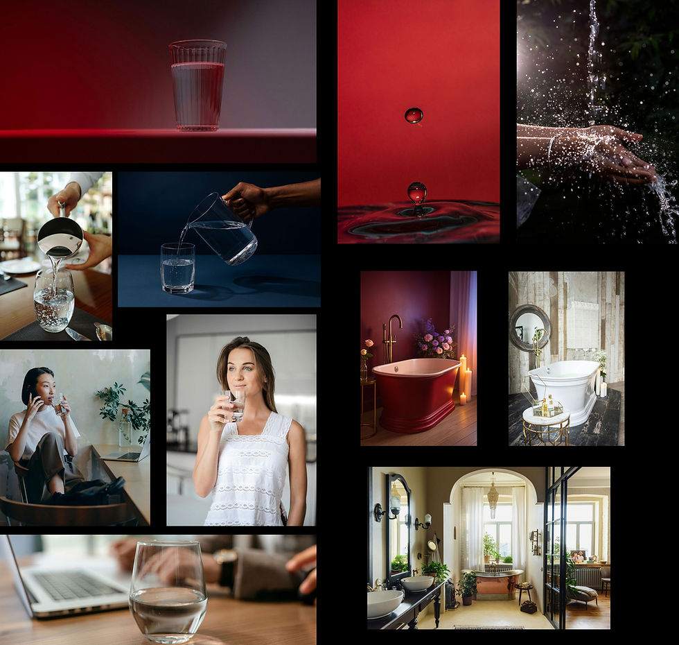
Curated Image Collage
A cohesive set of visuals chosen to establish the brand’s tone, palette, and aesthetic direction using themes of water, wellness, clarity, and quality.

Original Design Direction
The initial layout and imagery, built from scratch using the logo’s colors and a thoughtfully curated aesthetic that created a polished, unified experience.
Original Section Design:
The initial design applied the color palette and visual system in a way that felt balanced, premium, and unified. Using the dark blue as a background color allowed the bright logo red to stand out without overwhelming the layout, while the lighter blue from the logo served as a clean, crisp accent.
The imagery seamlessly matched each section’s background color, creating an intentional flow from block to block. The result was a site that felt elevated and trustworthy, with consistent emotional and aesthetic cues guiding the user experience.
This “before” version demonstrates the original vision and how the colors, content, and imagery all worked together to tell a cohesive story.
Requested Changes:
After the initial build, the client requested several revisions that shifted the direction. They asked to replace nearly all curated images because they might “imply plumbing,” a service they were considering removing in the future. They also asked to change the dark, sophisticated blue to a lighter, brighter blue, even though it did not complement the logo’s red.
While I adapted the design to reflect their preferences, the resulting version moved away from the cohesive, elevated aesthetic of the original. This contrast highlights how thoughtful color decisions and high quality imagery can strengthen a brand experience, even in cases where initial direction is extremely limited.

Client Requested Revisions
The updated version reflecting the client’s preference for lighter blue tones and imagery not associated with plumbing, resulting in a different visual direction.
Conclusion:
This project reminded me how much clarity and cohesion matter, especially when formal brand guidelines do not exist. With only a logo and a loose request to use its colors, I built a complete visual system that established tone, hierarchy, and emotional impact across the site. Even when the direction shifted late in the process, the contrast between versions highlighted the strength of intentional color choices, curated imagery, and a unified aesthetic.
Most importantly, it reinforced how adaptable I am. I can create a strong vision from limited input, collaborate with clients who are still defining their own identity, and adjust gracefully when priorities change. Projects like this strengthen my skills not only as a designer, but as a strategist who can guide clients toward clearer, more confident decisions about their brand.